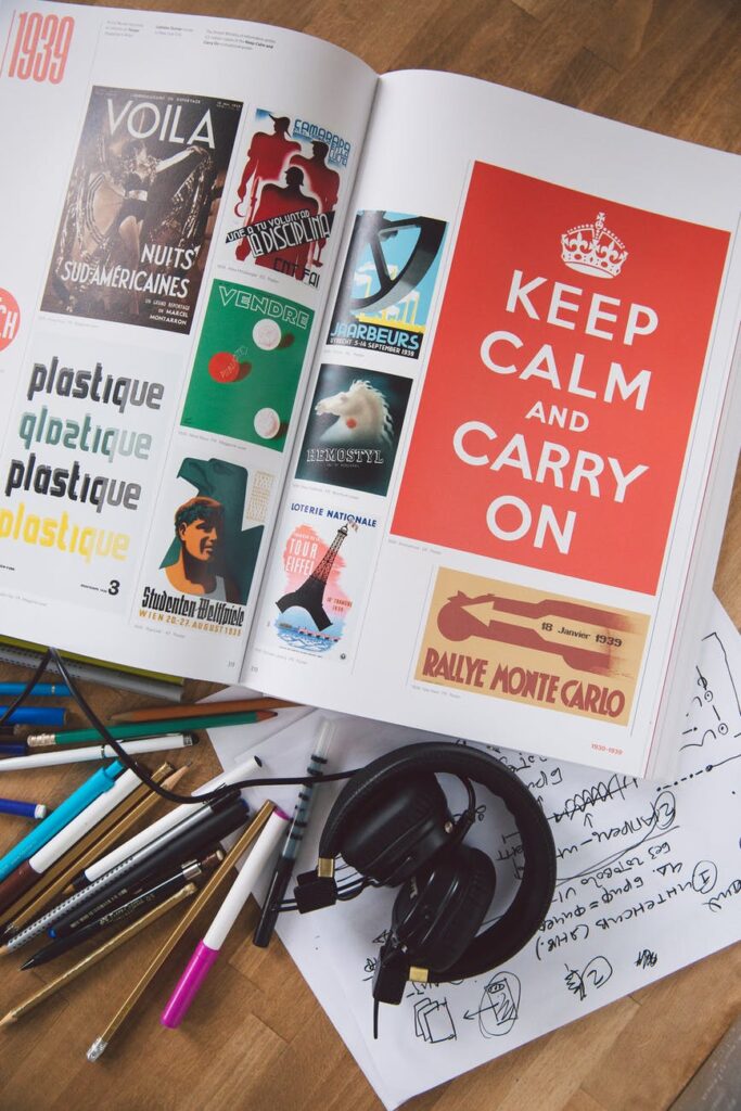
Photo by Polina Zimmerman from Pexels
Four graphic design cliches to avoid for a more professional brand
By: Stephanie Mayer
Designing for a brand isn’t an exact science. At the end of the day, design is subjective, and one style won’t appeal to everyone.
Nonetheless, there are some cliches in design that, while appealing to some, are best left avoided.
Iconic but overused fonts
There are some fonts that are all over the world of design – almost to an annoying extent – and they often leave a brand or logo feeling bland or unoriginal.
Fonts like Trajan, Times New Roman, Impact and Helvetica are stale from overuse. They’re not bad fonts, and they can help give off a certain feeling, but there are plenty of alternatives to make your logo feel more original.
For some guidance, you can look at 99designs’ list of the best and worst fonts.
Questionably-designed typefaces
You’ve likely heard of the one font that gets on almost everybody’s last nerve: the dreaded Comic Sans.
But keep in mind that this isn’t the only font to avoid. There are plenty of other fonts that have some strange design choices or are just downright ugly.
Fonts like Papyrus and Bonzai are what 99Designs dubs “fauxotic fonts,” – typefaces that try for an exotic feeling by mimicking design elements associated with certain cultures. However, instead of bringing an exotic feeling, these fonts just feel cheap and sometimes exploitative.
Notorious for their “fauxotic” look, fonts like Papyrus and Bonzai are better avoided.
Other fonts to look out for are “handwritten” fonts that don’t exactly feel handwritten, like brush script, or fonts that feel cheesy and busy, like Jokerman or Curlz.
Logo designs that look a little too familiar
Understandably, designers often use symbols while creating logos that act as a shorthand for what a company does or wants to represent.
This isn’t necessarily wrong, but a problem comes up when a logo uses the same symbols as nearly every other logo in the industry i.e. a globe for worldly and international companies, a house for a real estate agency or a lightbulb for an innovative tech brand.
Plenty of iconic logos, like those of Apple or Nike, have symbols unrelated to the product being sold. Experiment with logos that use less common symbols for your industry or a unique take on common themes to set your brand apart.
If you’re looking for more logo design tips, head over to this 1893 blog post about using logos to enhance your advertising strategy.
An excess of typefaces
As you can tell from the other tips in this post, choosing good fonts for your brand is essential for a clean, professional feeling. However, it’s just as important to act with restraint when it comes to your font choices.
A general rule is to use no more than three font families for your brand. As tempting as it may be to put all of the really nice fonts you’ve found on a promotional piece, using too many fonts can look amateurish and unrefined.
Also keep in mind how your font choices pair together. You want to make sure that your fronts complement each other, aren’t too similar and create an effective hierarchy. For more information on pairing fonts, look at Visme’s guide.
It can be difficult to keep some of these unspoken design rules in mind, and even more so when graphic design isn’t your forte. If you want to design a brand that is unique and professional, our designers at 1893 Brand Studio know how to get you there.
