When is a Logo Redesign Right for your Business?
by Gabi Allen
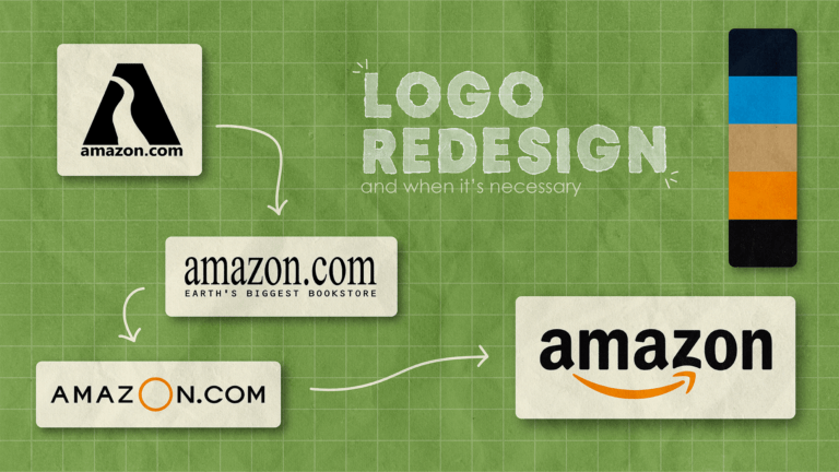
Illustration by Gabi Allen
Every successful brand has a well-designed logo. Take a second and consider where companies like Nike and McDonalds would be without the iconic swoosh and the globally recognized yellow arches.
Logos help a business stand out and distinguish them from the competition. For smaller businesses, a logo is key to making a strong first impression and must be memorable enough to keep customers coming back.
Logos are tricky, and it’s hardly ever the case that your business’ first logo is going to hold up over time, especially as design trends evolve through the years. So when is it time for a logo redesign or refresh for your business?
Has your business or services changed?
If your business has expanded, is offering new services, or has changed names, it’s most likely time for a redesign.
Take Amazon for example. At the time of Amazon’s founding, the company only sold books, and its logo reflected that. Now Amazon sells way more than just books and redesigned its logo in 2000, introducing the icon yellow arrow that shows they sell everything from “A” to “Z”.
Has your customer base changed?
A large part of expanding your business means expanding your audience. In recent years, many brands have transitioned to targeting Generation Z with their marketing by following trends made popular on social media.
In 2021, Burger King reverted back to their logo from the 1970s to 90s following the nostalgia trend to appeal to Millenials and Gen Z. The rebrand also switched to a more “natural” color scheme to mimic fast food companies like Chipotle and Panera that are loved by Gen Z.
Is your logo outdated?
Design trends change almost yearly, and if your business has been around for decades, your logo from the 80s most likely won’t hold up in today’s market. Your logo should portray that your business is cutting edge, trendy, and aesthetic in the eyes of your current customers.
If a customer is looking for an internet plan for example, they likely will turn to the most modern and state-of-the-art company. If AT&T is still using its logo from the 90s, customers would likely equate their internet service capabilities with that time period.
Logo Refresh vs. Redesign
You have decided that your business’ logo needs an update, so where do you go from here? You must decide how much of an update you want to make based on the goals of your business and the state of your current logo.
A logo refresh is the smallest update you can make and focuses on making minor changes to the appearance of your logo to stay up to date with trends and the competition. One way to refresh your logo is changing the font, like Google does every couple years.
A logo redesign implies creating completely new visuals. Some examples include Instagrams switch from a polaroid camera to a simplified gradient icon in 2016 and IHOPS redesign from its traditional logo to a simplified, digital-friendly design in 2015.
When choosing between a logo refresh and redesign, there are a few factors to take into consideration.
Is your current logo recognizable?
Once your business gains a following, you don’t want to risk your current customer base by making your brand unrecognizable, so a refresh is probably the best option.
Tip: Famous logos like Target and Apple don’t need words to be recognizable globally. But for small businesses, it is imperative that your company name is always a part of your logo.
Are you wanting to implement a new brand strategy?
If you want your brand to send a different message, you probably need a redesign. When Mountain Dew decided they wanted to make gamers their target audience, they rebranded from the country, 70s aesthetic to a sharp, electrifying logo to put on their new energy drinks.
Think your business is due for a logo redesign or refresh? 1893 Brand Studio’s team of designers can help. Contact us at sales@dailytarheel.com to learn more.