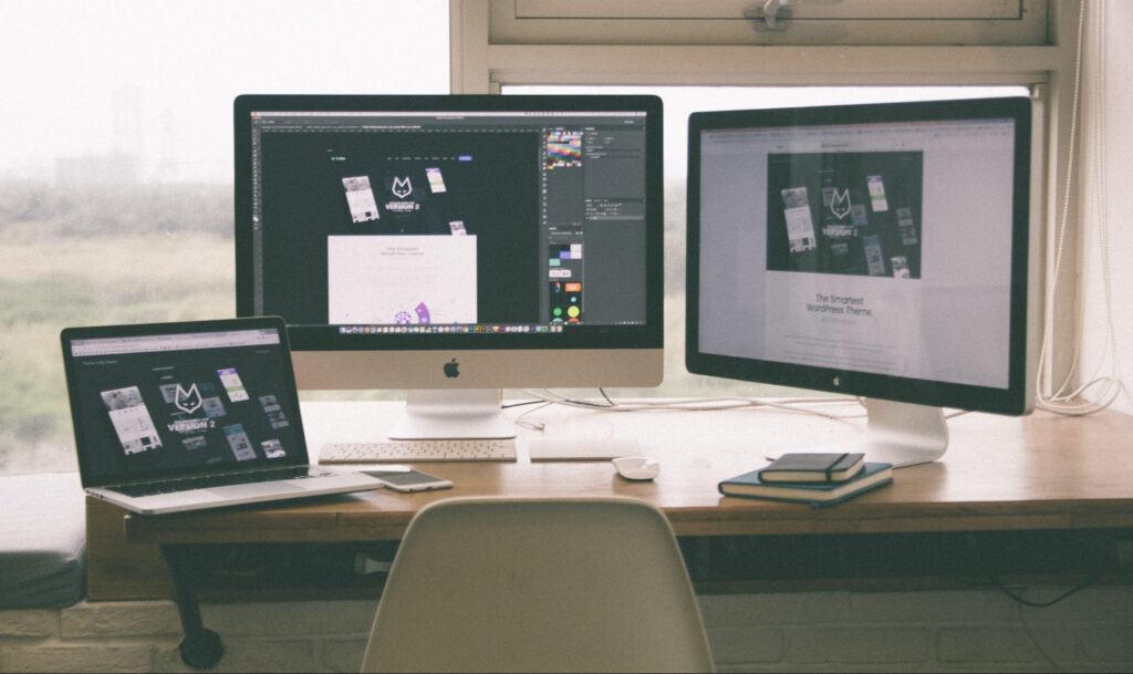
How Design Hierarchy Can Make or Break Your Website
By Stephanie Mayer
When thinking about a company’s web presence, the individual elements that make up its brand likely come to mind first: typography, colors, etc.
But one of the most important — and often overlooked — facets of web design is visual hierarchy, which leverages all of these aspects to elevate the overall quality of your website.
What is Design Hierarchy?
Visual hierarchy seems like a lofty term, but according to the Interaction Design Foundation, all it refers to is ordering elements based on importance. Based on how the web designer incorporates different elements of hierarchy, they can help the most important parts of a brand’s message stand out.
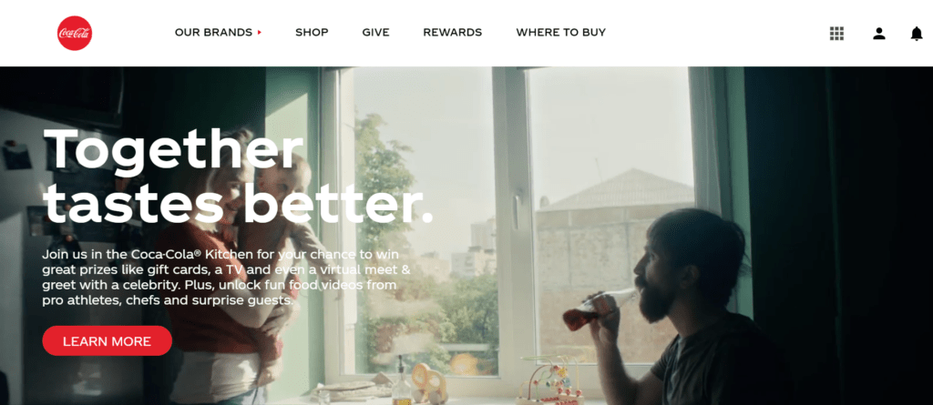
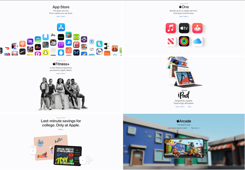
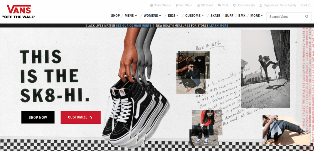
Some important elements of visual hierarchy are size, color and contrast, proximity, alignment, whitespace and balance, which we’ll explore in relation to web design.
Size
Just as it sounds, sizing refers to changing the size of different elements on the page. The larger an element is relative to the rest of the information, the more important it will seem. Additionally, using scale to suggest perspective in different graphics can add visual interest to a site.

Color and Contrast
Brighter and more saturated colors tend to attract the eye first. Designers can use different colors and levels of contrast to their advantage, although it’s important to be strategic and careful when highlighting certain elements over others.
Proximity
Elements that are placed closer together are often seen as being related, which should always be considered when laying out a website.
Using a closer proximity for similar elements — and avoiding too much closeness when it comes to separate elements — can really contribute to a positive user experience.
Alignment
Similar to proximity, elements that are in line with each other, either in rows or columns, tend to be read as one unit. On websites, alignment is typically seen in navigation bars and other complementary points of entry.
Whitespace
This term refers to the negative space around elements on asite. Open space around items helps create a clear sense of organization by grouping different packages of information while making for a stylish and understandable layout.
Balance
To help your website feel like a complete and polished project, using balance will go a long way.
Symmetrical balance — where elements are basically the same on each side — and asymmetrical balance — where elements aren’t perfectly even, but their visual weight balances out — are both great ways to accomplish this visually appealing look.

While each individual aspect of a brand’s online design is very important, web designers should also make sure that these aspects work well together and are laid out in a way that is stylish and conducive to relaying the brand’s message.
At 1893 Brand Studio, our Web Development and Graphic Design team can help elevate your business’ website with techniques like these. To learn more, visit our Web Development and Graphic Design pages.
Contact us today to schedule a consultation.